Innovative eCommerce, with new features, and all in ONE WEEK? Challenge accepted!
Author: Jair Pérez – Lead Product Designer at Reservamos SaaS
The decisions we have made about our eCommerce and the solutions designed have been supported by data and evidence, from the slightest change to the development of new functionality. But how far have we gotten with this?
Thanks to the learning process and experience acquired, we knew that having a visual variant of the eCommerce solution would be necessary for brands to differentiate themselves, even with the services we offer to the bus sector.
THE CHALLENGE
Recently, we had the challenge of designing and developing innovative eCommerce with new features in ONE WEEK for one of our allies, and we had only one chance to make it right. Once we agreed on a schedule with our client, we challenged ourselves to accomplish our goals, and boy, was 2020 a pretty tough year!
THE PROCESS
During the first meeting, we came up with the idea of having a product with a sidebar throughout the funnel. The information in the sidebar would change according to every step of the journey; at this point, we began to think about what changes we could implement that would not require so much support from the Front-end area.
Having an organized and well-structured architecture needed us to think about the possible changes that we could integrate. Although some ideas came up, such as changing the product’s visual style and playing around with shadows and borders of the same components, the team remained uncertain as the ideas sounded a bit abstract.

We have created a product area with functions focused on performing more efficient maintenance processes and reducing development times to achieve an organized code structure. Since these principles have been of great help to us, we have also transferred them to the layout part with “Atomic Design”, allowing more agile interfaces and efficient project management.
OUTSTANDING
The work structure we designed and the team expertise made us possible to create the product funnel proposal in only ONE DAY! This mock was necessary because, in a certain way, it would work as a map to execute the essential changes at the code level.
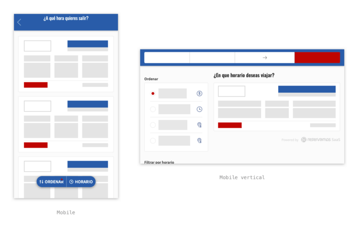
We kept the sidebar during the funnel, reduced shadows, and added borders with a decreased radius; it was also possible to design a different component to show the trip results and display a cleaner and more friendly design.
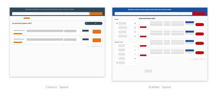
Once we presented the mock to the internal team, they were able to verify that we had managed to have a new product version by making this series of small changes. We had overcome part of the challenge!
LEARNING
Having a solid code structure and certain variables within it, we began to implement the essential changes for this product version without affecting the standard version code. Also, we could switch versions if we needed to. Despite the time pressure, the work was always executed in the most orderly way possible, thanks to our structure guidelines.
The second part of the challenge was a complete unknown. We did not have enough data and history to know if this product version would have the purchase conversion we were expecting and the necessary loading speed. We started having a conversion very similar to the results of the current product, and little by little, it started showing growth.
A few months later, we reached record sales figures for online sales, higher than offline sales in over 60 years.
Do you want to be part of small changes that turn into big sales? Contact us for more information at [email protected] and manage to promote your bus line eCommerce.

